|
Models of Learning
Developed by
Jill O'Reilly
Hanneke den Ouden
-August 2015
|
Fitting real data using a grid search
Finally, we can start to plot the data we collected from real subjects!
Individual data: you!
First, let's estimate the learning model for your own data.
subjects = *your subject number*;
simulate = false;
fitData = true;
plotIndividual = true;
... save, and run. If you didn't do the task, just pick subjects 1:2.
This will show you 3 types of plots:
-
Trial-wise plot that you saw earlier plotting your own choices and the true underlying probability of reward for the blue slot-machine (p(reward|blue)), the running-average choices (dashed red line), and now in turquoise the estimated probability of choosing blue (p(choose blue).
Does the estimated choice probability follow your choices reasonably well?
-
Likelihood surface plot. Is the surface plot nicely peaked? Or is there a lot of structure in the plot that might indicate a correlation between parameter values?
-
Marginal parameter distributions. Are the distributions relatively normal, or very skewed? Are they peaked (ie do you have high confidence in a single value) or very broad . Are the distributions cut off at the bounds? That might indicate you need to relax the bounds a little.
Group data
We'll next do the analysis across all the data. First, let's have a look at what the group data actually looks like, when averaged across our subjects.
In RLtutorial_main set :
subjects = 'all';
simulate = false;
fitData = false;
plotIndividual = false;
... save, and run
This plot does shows you the observed average choice across participants for each trial (which is why there are no error bars!).
You also get a bar plot with the average proportion of correct choices for both the high and low volatile groups
-
Does it look like one of the two groups is better than the other?
-
How does this compare to the simulated data? Can you think of why these might differ?
Next we will fit the model to all of the available data. Set,
fitData = true;
... save. This time, instead of pressing 'run', type in the command line:
fitted = RLtutorial_main
... and hit Enter. This will return the fitted parameter values to the workspace.
First, we'll look at the figure, showing full probability distributions for each of the parameters for each subject. Below you see an example with only a few of the subjects.
?
Parameter estimates for α and β - distributions
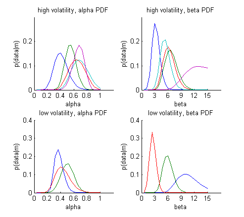
Each coloured line is one individual subject. Note that the subjects plotted in the high vs. low volatility conditions are not the same individuals
- These probability distributions give us a sense of how confident we are in the estimated
value for each subject and parameter. For some of the subjects the tails of
the distributions are cut off. This might mean that you need to expand your bounds, particularly
if there is no theoretical reason to not expand them.
- For example, α is usually constrained to [0 1] which ranges from no learning to full updating of your belief based on only the last trial. For β, we discussed the bounds previously: while there is a theoretical lower bound of 0 (=random choice), there is no upper bound (remember beta = inf meant completely deterministic behaviour), so we could easily expand this bound when estimating the parameters
When looking at the full plot of all of the subjects, do you think that the parameter estimates are very different for the high and low volatility groups? Or perhaps you find these plots a little hard to read?
Indeed, because these parameter density plots are a little hard to read, we can also summarise these parameter estimates (based on the maximum likelihood and expected value) across subjects:
?
Parameter estimates for α and β - summary
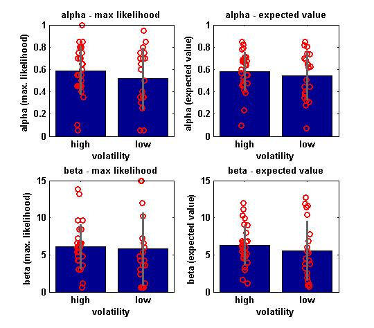
Average estimated choice probabilities(blue) +/- standard deviation(grey), and individual datapoints(red)
LEFT:'maximum likelihood' based estimates, i.e. the peak of the distributions in the figure above.
RIGHT: 'expected value' based estimates, i.e. the means of the distributions in the figure above.
Using the mean can result in more robust parameter estimates.
Do you notice any marked differences between the EV and ML estimates?
?
-
For the ML estimates, there are a couple of parameter estimates that
hit the upper bounds. This means the highest likelihood is in the first
bin. However, when using EV, you use a weighted average across bins, and
thus one effect of using the EV is that the parameter estimates are
kept away from the bounds.
-
As a result, the EV estimates are (usually) better behaved and more normally.
However, if parameters hit bounds may also
serve as a warning signal, that tells you your bounds are too tight.
This holds particularly if there is no theoretically defined limit (see above).
Therefore, it is a good idea to inspect the likelihood surface plots or the ML estimates.
Finally, let's have a look at how the average choice probability compares to the average choices
?
Estimated choice probabilities
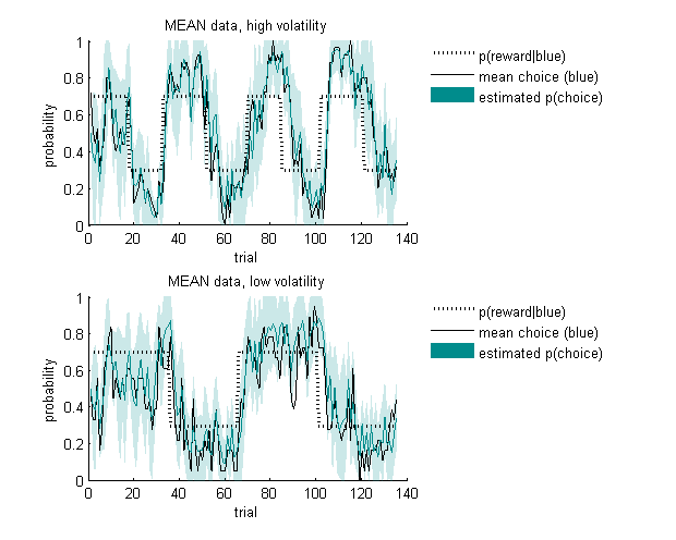
Average estimated choice probabilities +/- standard deviation.
The average estimated choice probabilities across subjects for each of the conditions follow the average group choice well. Note that this is a slightly strange representation as for each individual, the choice data is a binomial vector of [0 1] choices, while the estimated p(choice) vector can take on any value between [0 1]. This is therefore not a plot to do statistics on, but rather to get a global idea of how well your model is doing.
In the next section, we will have a very brief look on how you would do inference on these parameters.
►►►
|